Antares Panamericana
UI/UX Designer
1 week
Figma file with high-fidelity prototype
Description
Redesign of the user experience (UX) and interface (UI) for the Antares Panamericana e-commerce, a leading company in Telecommunications, Energy, and Security solutions for SMEs in Venezuela. My role as a UX/UI Designer focused on reconceptualizing the online store to prioritize usability and effective product presentation, transforming a functional site into a strategic sales tool.

General Objective
Completely redesign the interface and information architecture of the e-commerce to create an intuitive, visually attractive, and user-centered experience, in order to facilitate the discovery and acquisition of products, thus improving the brand perception and commercial effectiveness of the website.
Problem
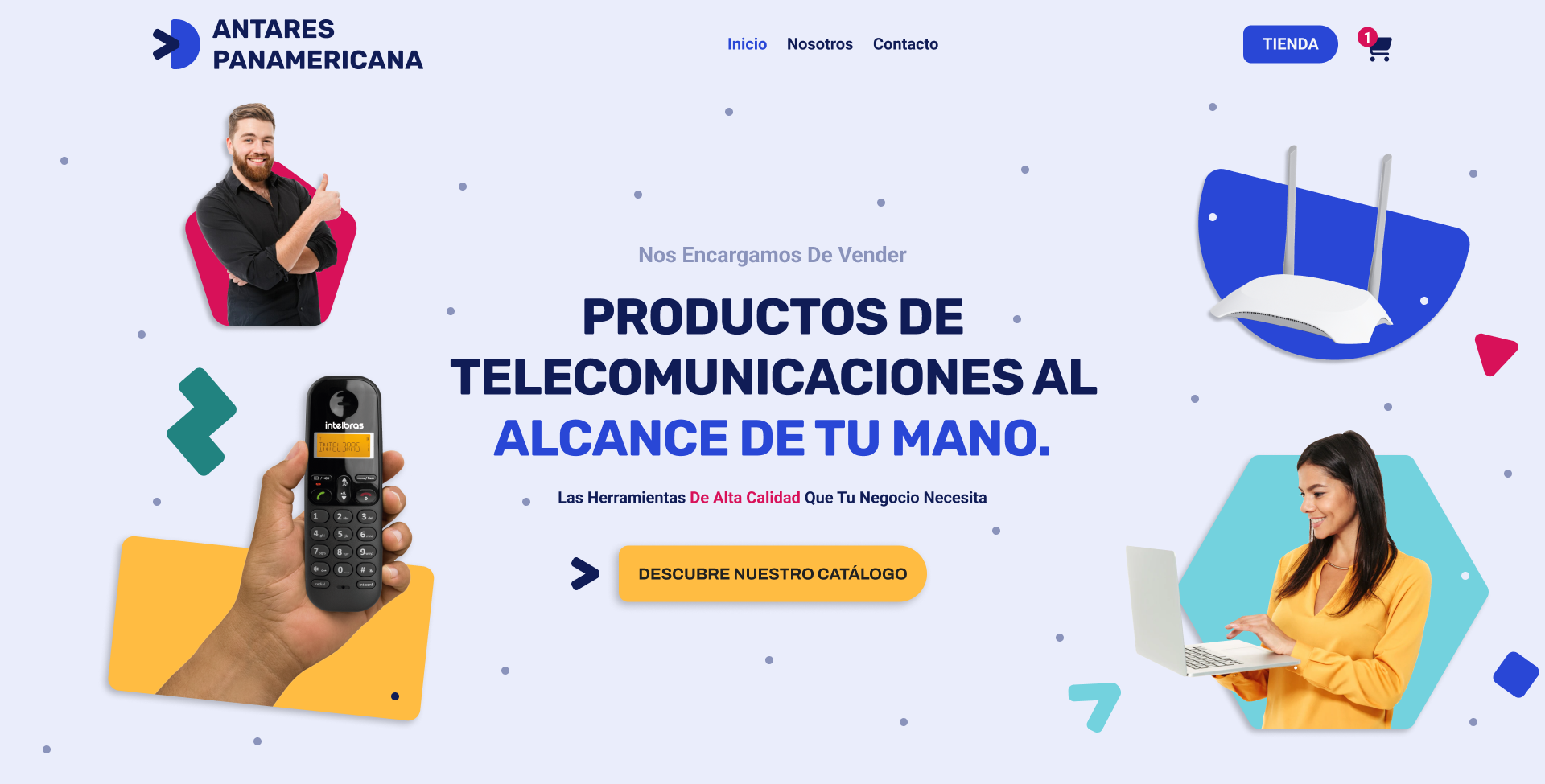
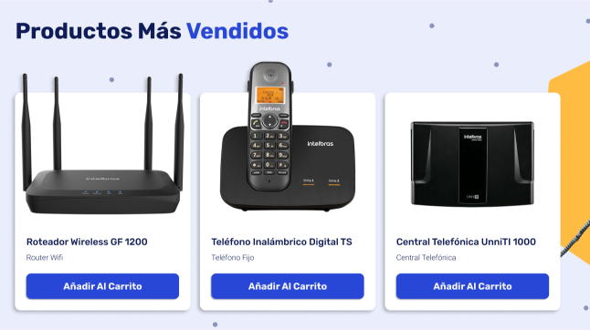
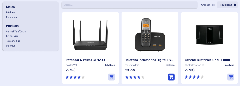
The existing Antares Panamericana online store, although operational, had serious design deficiencies that limited its effectiveness. The information flow was counterproductive: the first three sections of the homepage did not display products, wasting the user's initial attention. In addition, the interface was not very functional, with critical elements such as CTAs (Calls to Action) and product cards being too small and low visibility, which created a confusing and unattractive user experience for its main client: the SME entrepreneur.
Research
The process began with a competitive and audience analysis. The research revealed that, in this B2B sector, buyers seek efficiency and clarity. Unlike the competition, whose pattern was to immediately highlight products and services, the Antares site buried its offer. This confirmed the need to reorient the visual hierarchy to align with market expectations and the needs of the SME user, who needs to find technical solutions quickly and reliably.
Solution
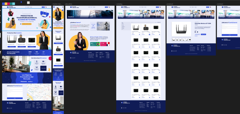
A complete and responsive design was delivered in Figma, accompanied by a coherent design system to ensure scalability. The solution focused on three pillars:
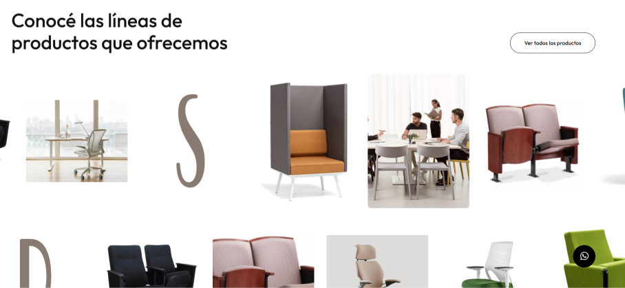
Product-Centered Hierarchy: The homepage was reorganized so that the first thing the user sees is a showcase of key products and services, immediately directing traffic to the main categories.
Improved Usability: All interface components were redesigned, enlarging and improving the visibility of CTAs, product cards, and navigation elements, creating a clearer and more accessible tactile and visual experience.
Strengthened Visual Identity: A more modern and striking appearance was developed, using Antares' brand palette but applying it more boldly and contemporarily to generate a greater visual connection and convey professionalism.
The final design was enthusiastically received by the client, who validated that the new proposal solved usability problems and perfectly aligned their online presence with their business objectives.